Batne – A Rebranding that colors nature with magic
This project was born from the desire to reimagine the way we connect with nature through a vibrant and playful vibe.
Feelin’ alive and brand new
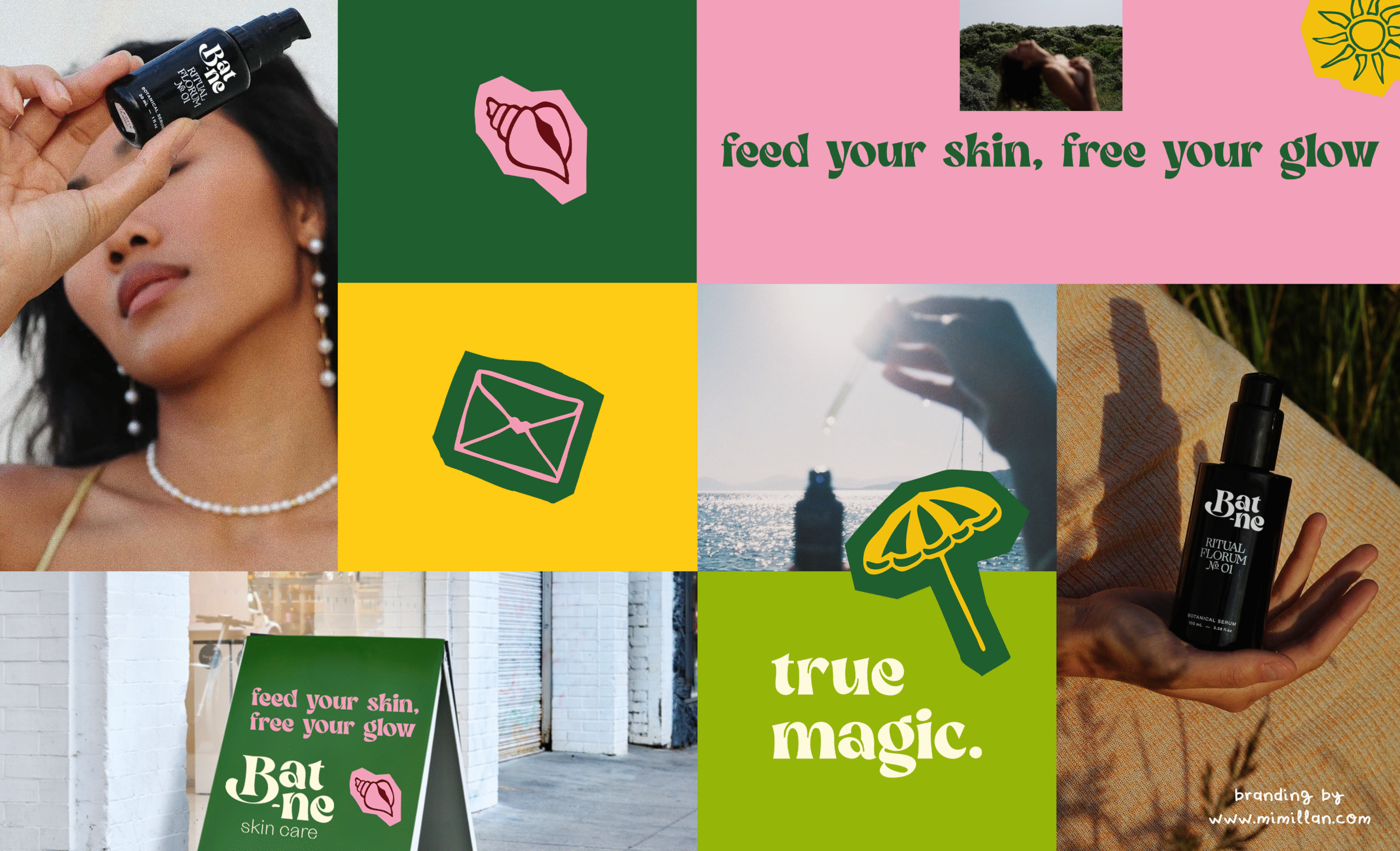
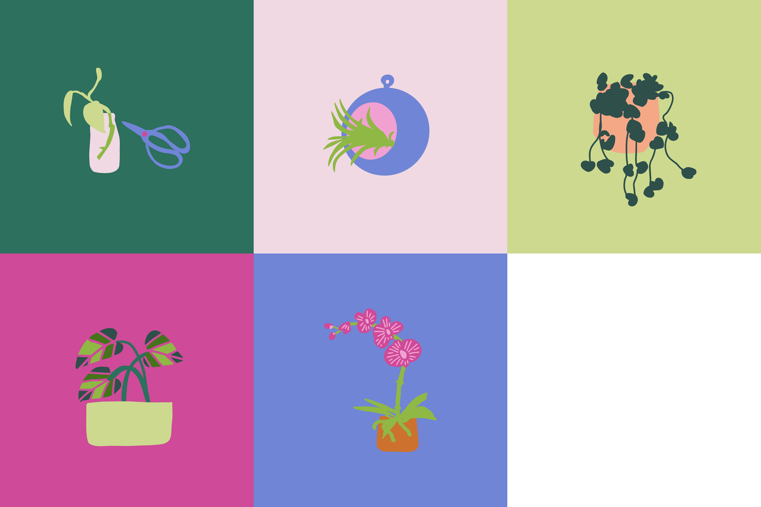
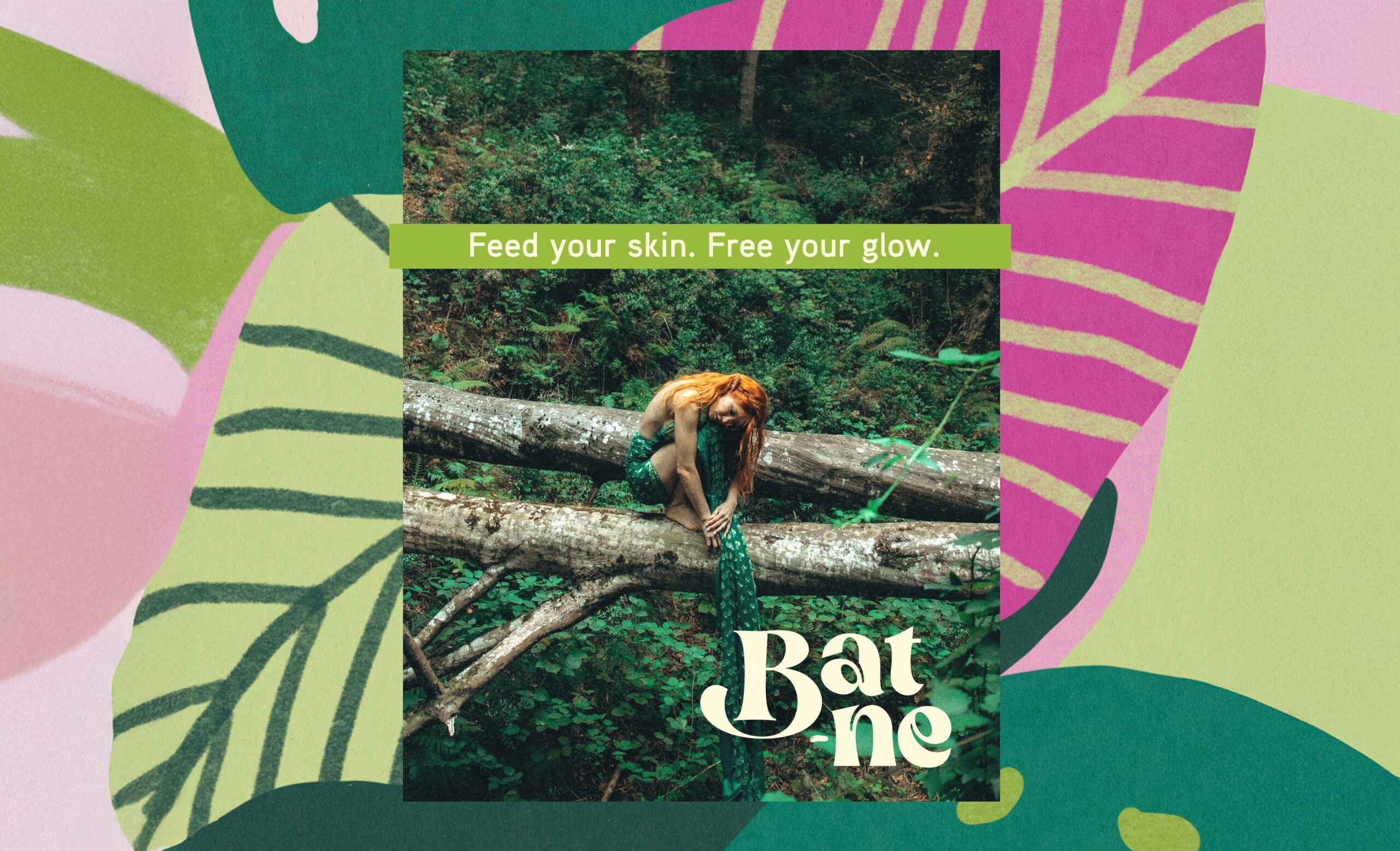
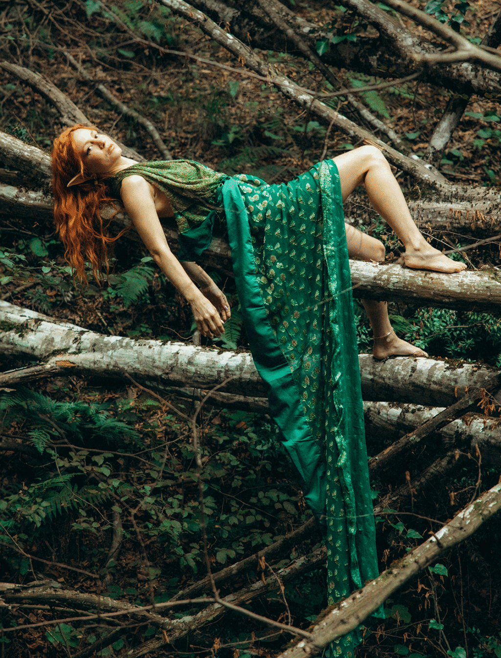
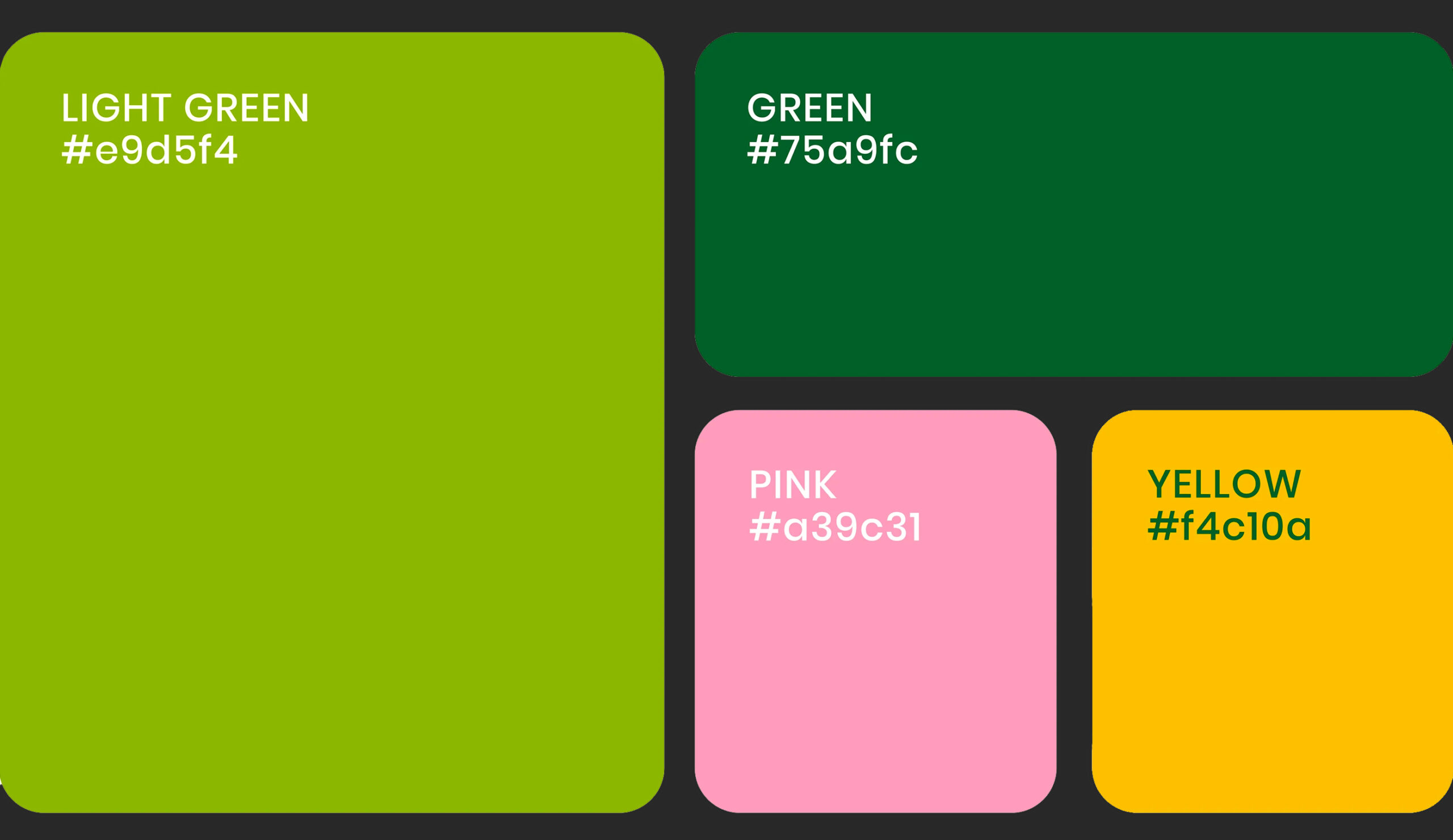
The rebranding sought to infuse the organic beauty of the natural world with bold, magical energy transforming leaves, textures, and wildlife into a kaleidoscope of colors and fun shapes. Every design element was crafted to feel alive creating a visual universe where nature’s magic isn’t just observed, but celebrated.
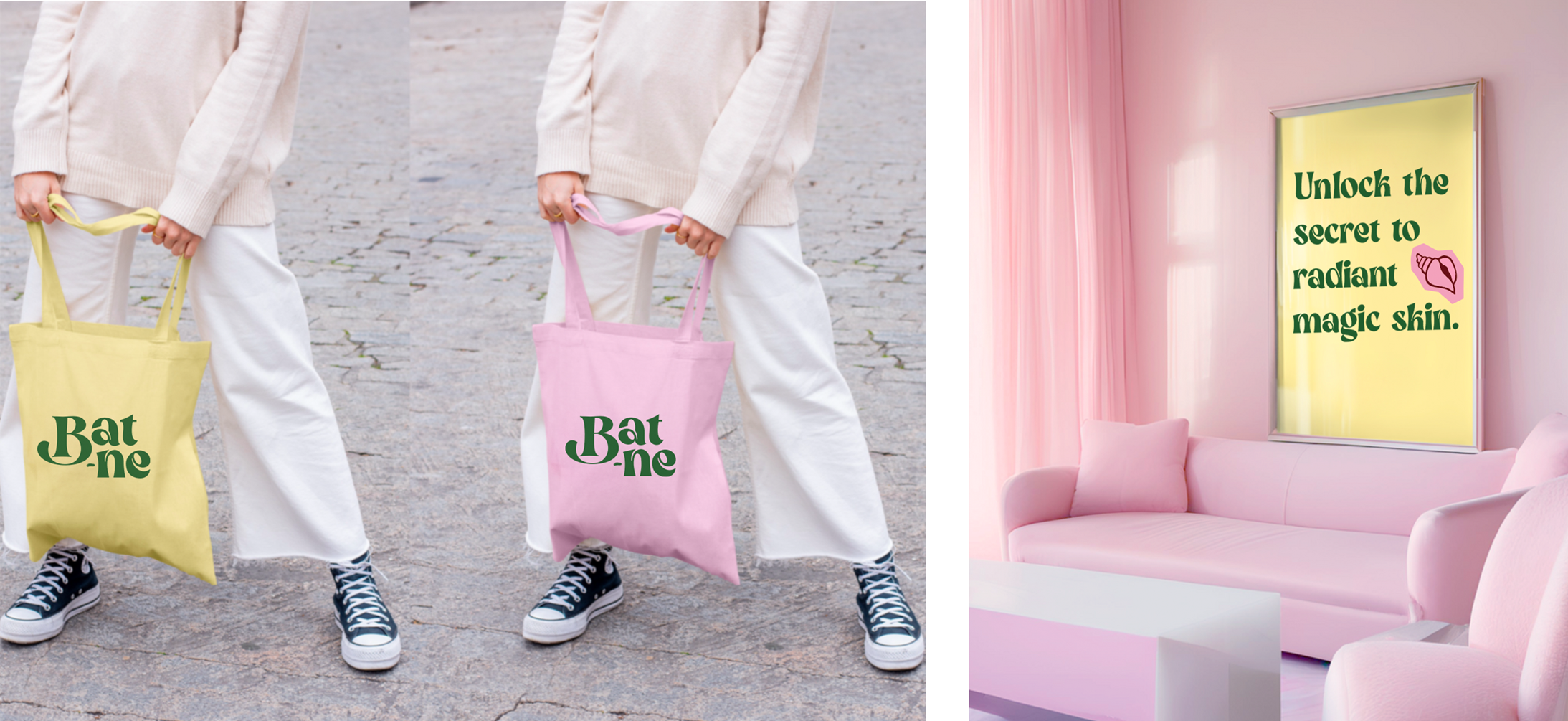
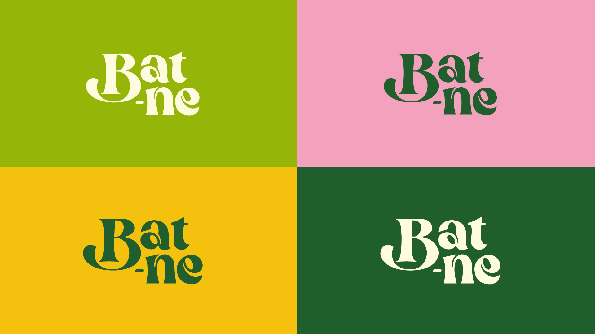
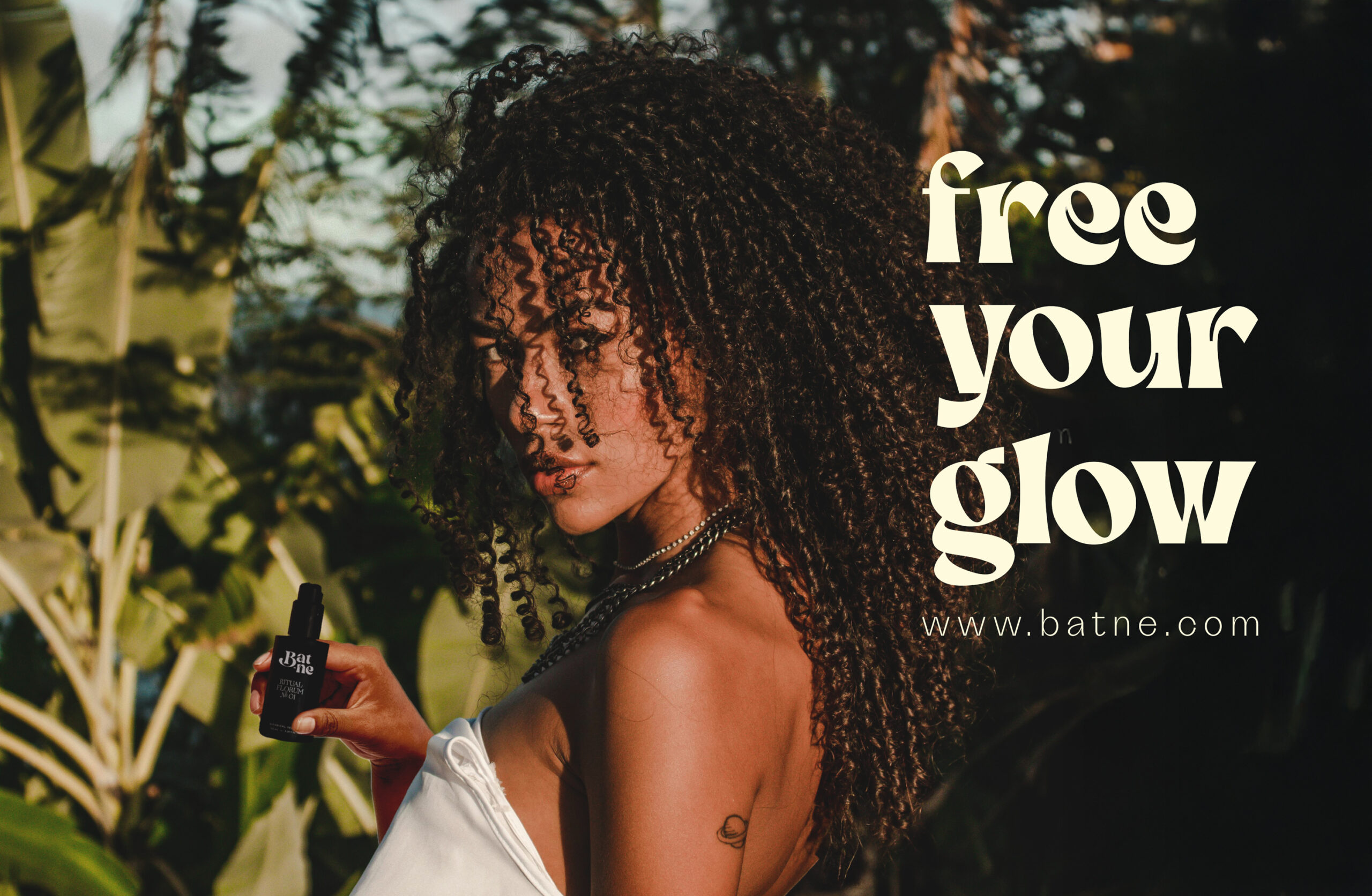
The typography, illustrations, and imagery merge storytelling with design, turning an identity into a sensorial journey. It’s a reminder that nature is not static; it’s fluid, radiant, and ever-changing. By embracing this playful, almost fantastical approach, this brand becomes a bridge between the natural and the magical, showing that the forest, the animals, and even the smallest leaf are bursting with untold stories.
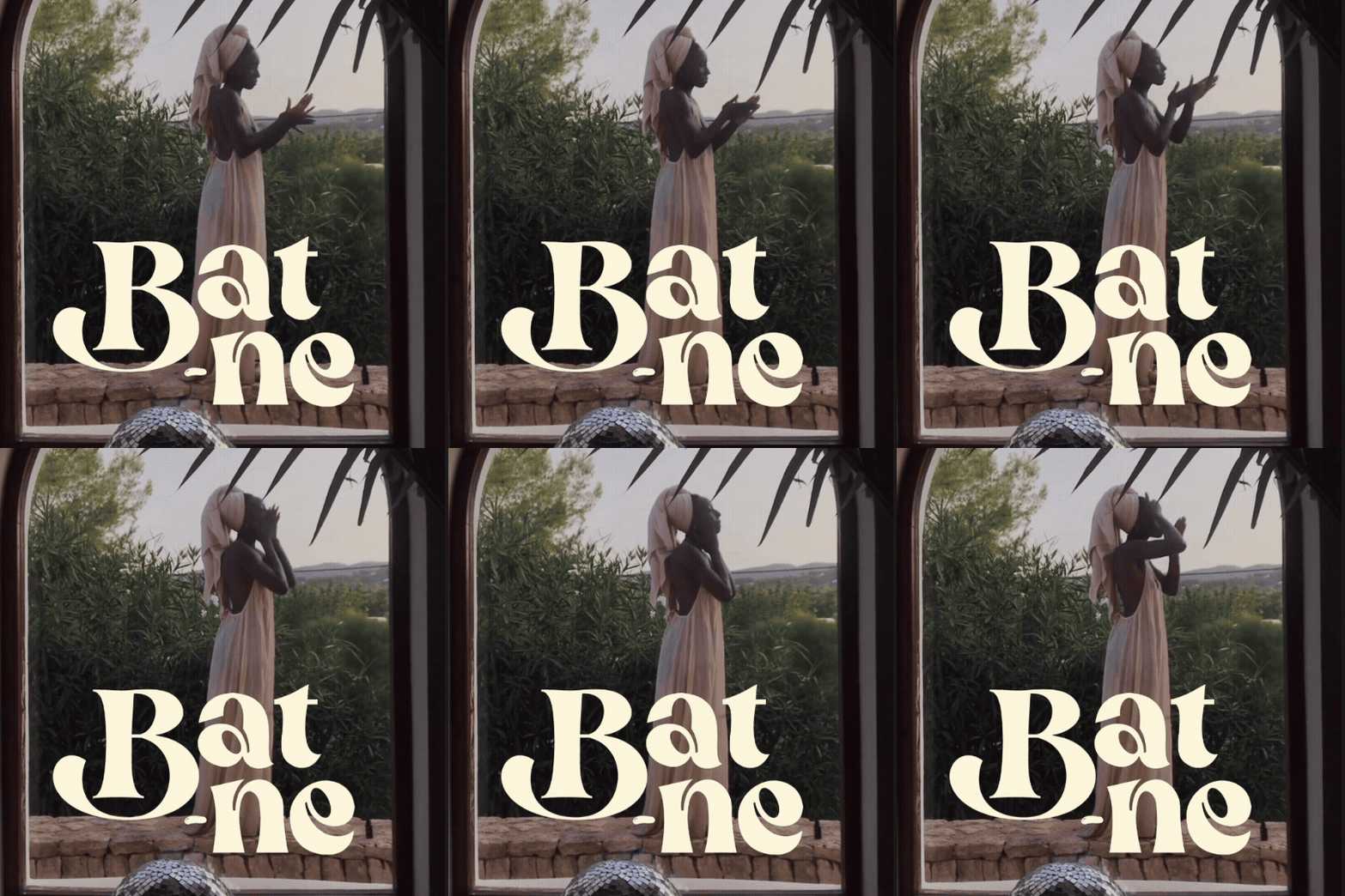
This rebrand transforms everyday interactions with the brand into moments of discovery, moments that sparkle with true magic. It’s not simply about nature; it’s about celebrating it with the same energy, vibrancy, and imagination that the wild world itself inspires.
Wanna create something cool? Say hi! mimichellemillan@gmail.com
